Clariens
Excellence in Medical Education
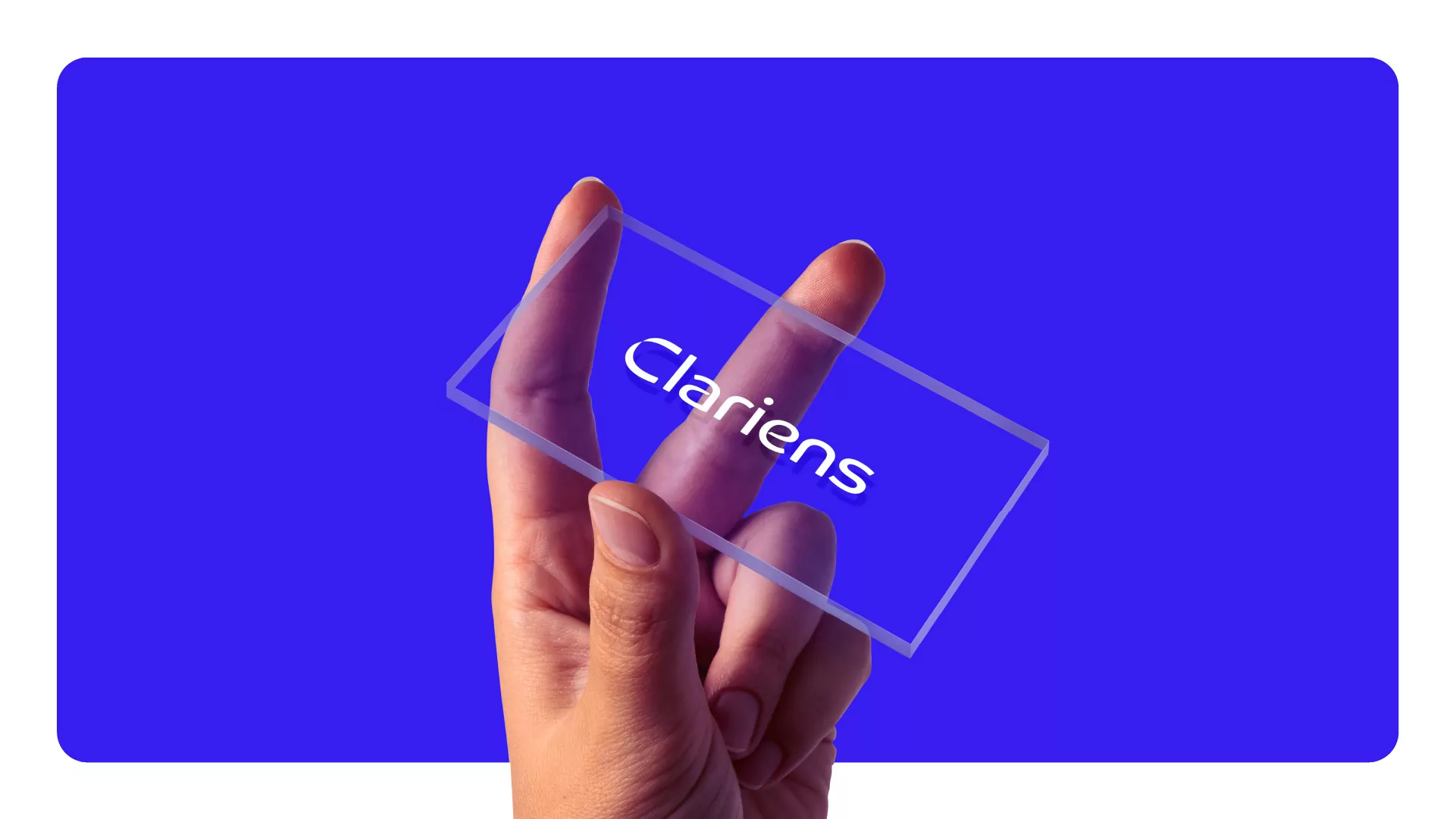
Keenwork was responsible for creating the Clariens Educação brand, a Mubadala Capital company founded with the purpose of elevating medical and scientific education by developing exceptional professionals guided by human values, ethics, and a commitment to society’s needs.
Our challenge was to build an identity capable of conveying excellence while bringing together science and human connection. The inspiration came from the light of science, knowledge, enlightenment, and clear vision, elements that illuminate the path toward meeting humanity’s needs. From this idea, the name Clariens was born.
The visual identity draws inspiration from the DNA helix, a symbol of life and the new frontiers of science. The logo expresses precision and dynamism, while a palette of blues and vibrant gradients communicates vitality, innovation, and progress.
The branding project established Clariens as a distinctive, modern, and memorable brand, capable of standing out in a highly competitive sector.
Services
- Brand strategy
- Naming
- Branding
- Visual and verbal identity
- Brandbook
- Go to marketing