Automa
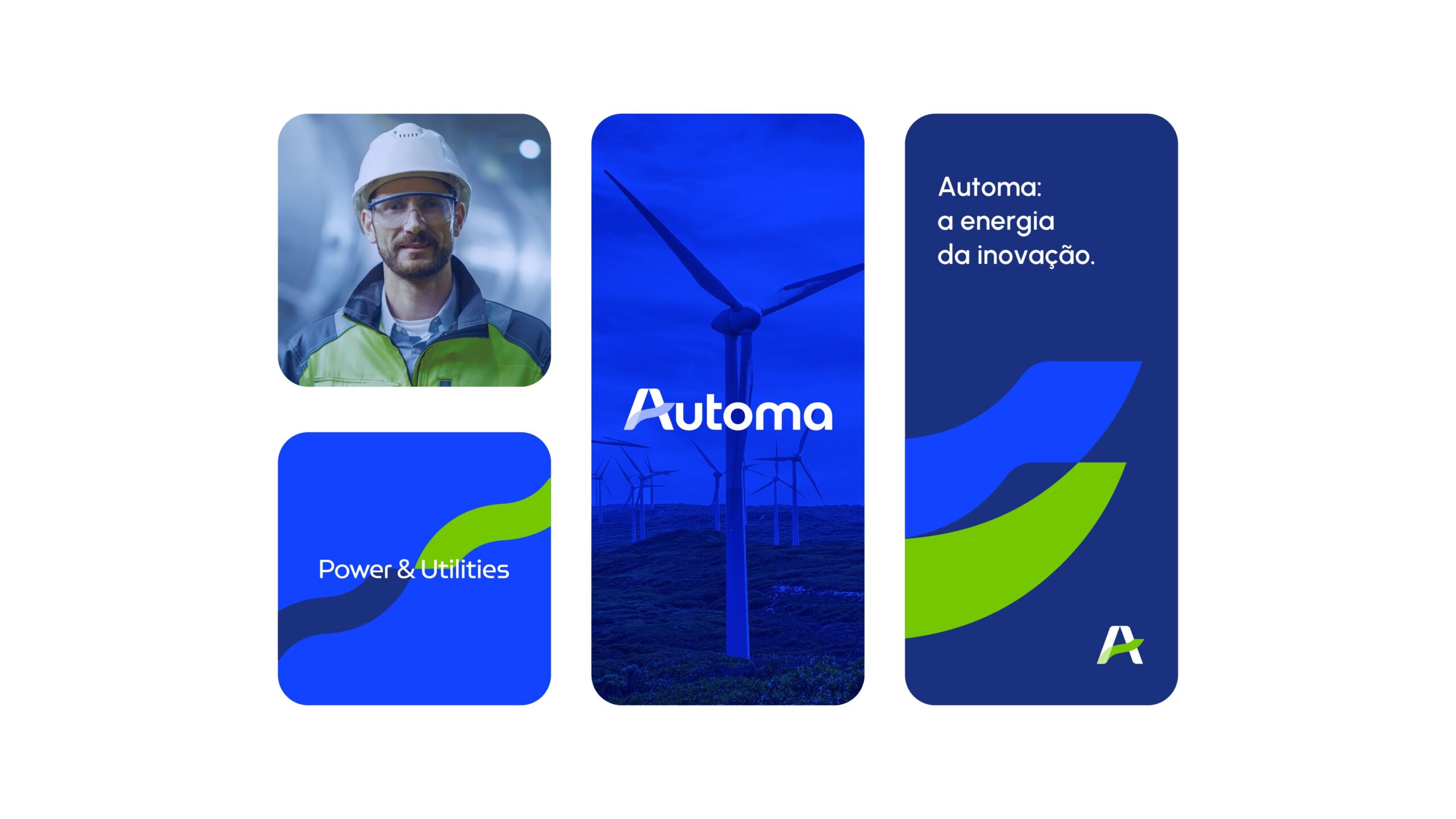
Automa Power & Utilities is a leading brand driven by the purpose of helping energy companies become better and more efficient. To support this vision, we redesigned the brand, formerly known as Automalógica, based on a new strategy and positioning that prepared the company for its next stage of growth and reinforced its leadership in technology for the energy and sanitation sectors.
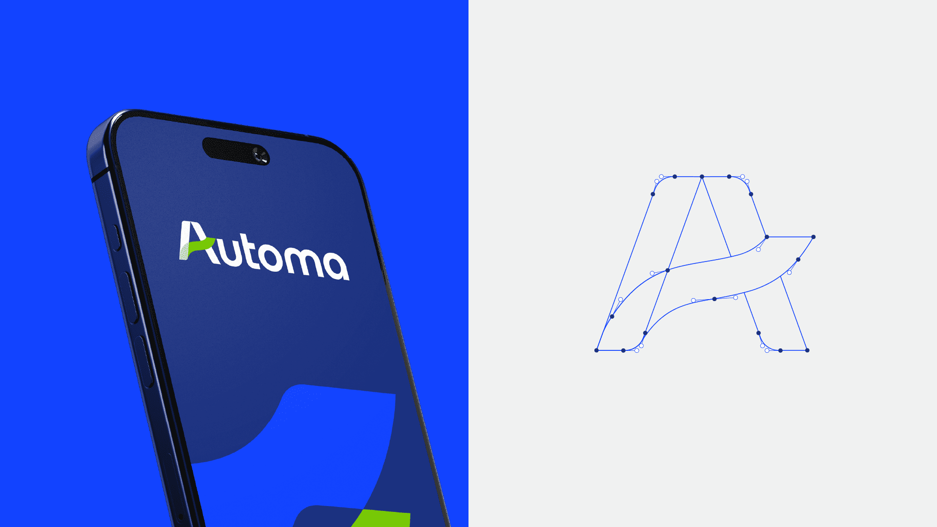
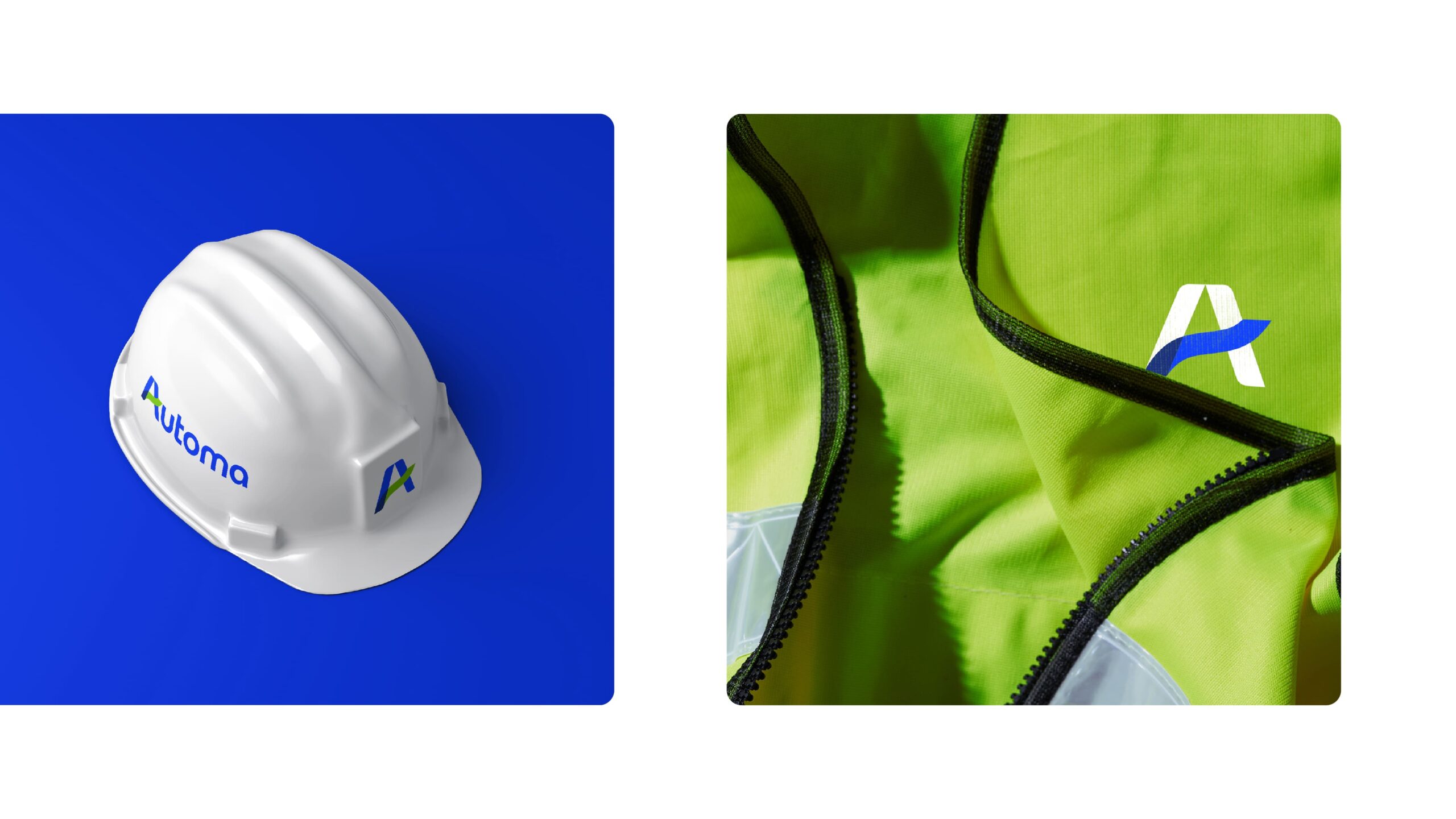
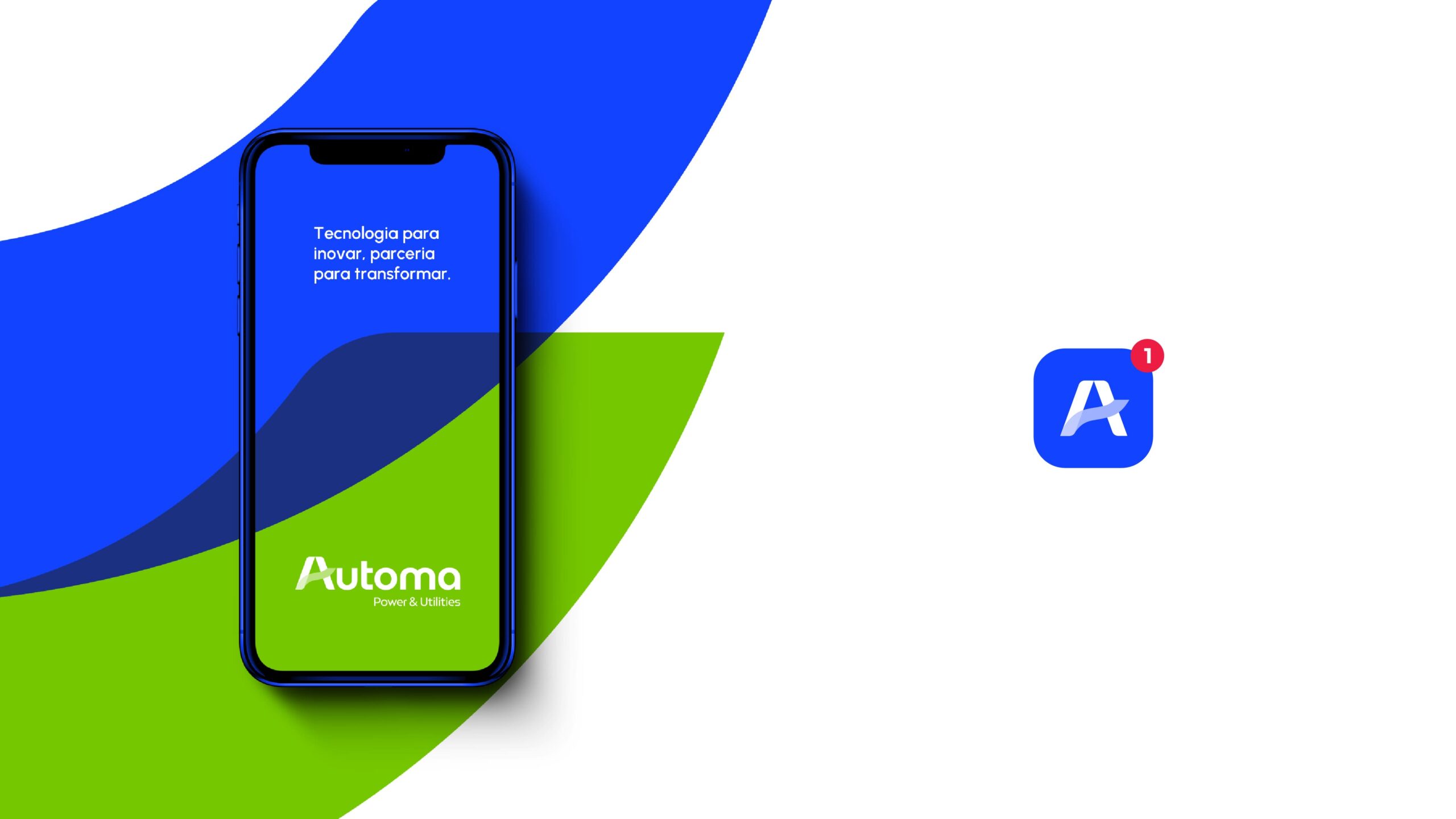
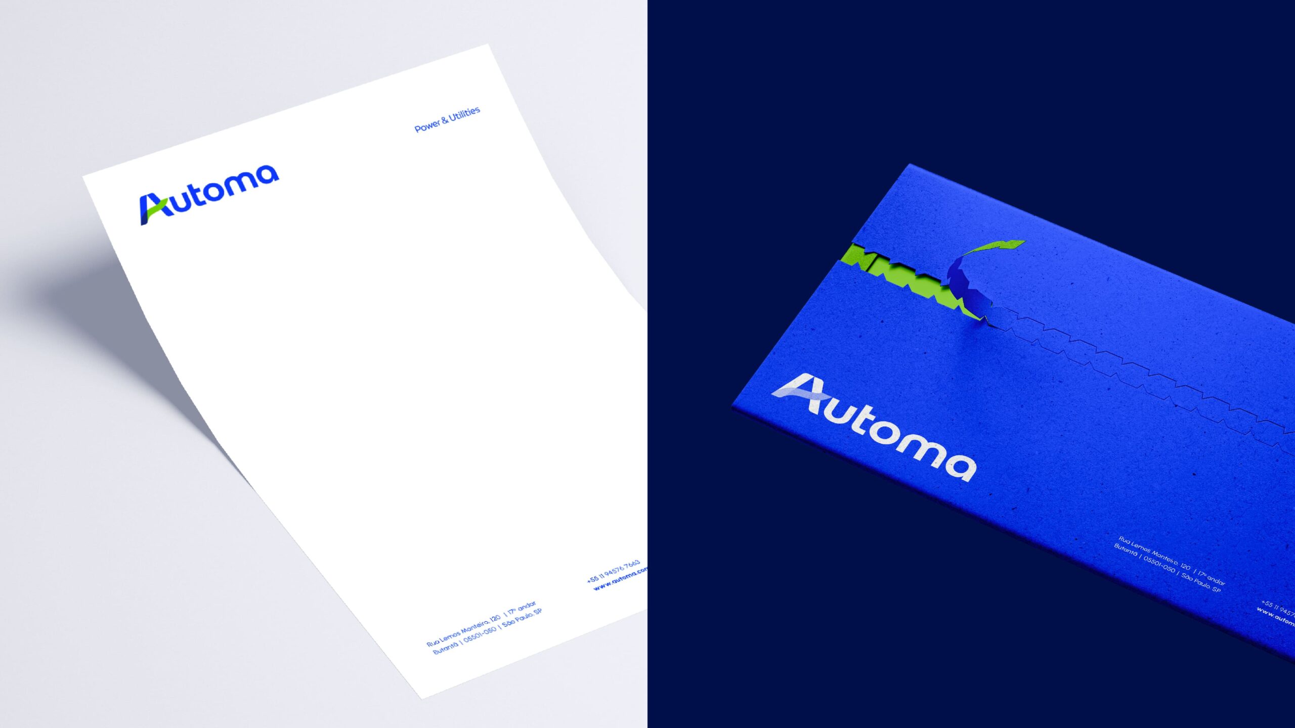
The redesign graphically expresses the spirit of innovation that is part of Automa’s DNA, while also highlighting the human side of the business and its close relationship with customers. The new visual identity unfolds through graphic elements derived from the logo, reinforcing the concepts of movement and integration while maintaining a visual connection to the previous brand. This approach communicates evolution rather than disruption.
The result is a visual territory built around fluid and human-centered elements, emphasizing that technology exists to serve people.
- Brand strategy
- Brand platform
- Naming
- Brading
- Visual and verbal identity
- Brandbook
- Design site
- Go to marketing