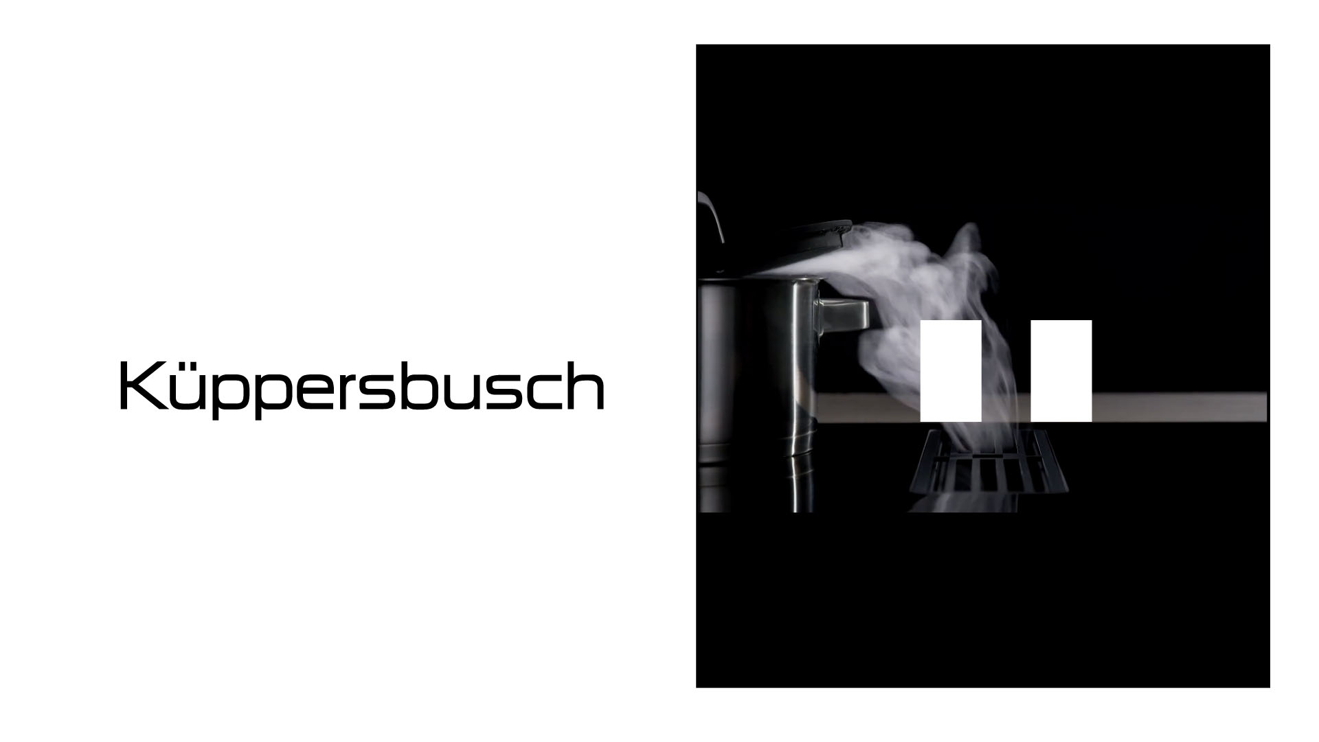
Kuppersbusch
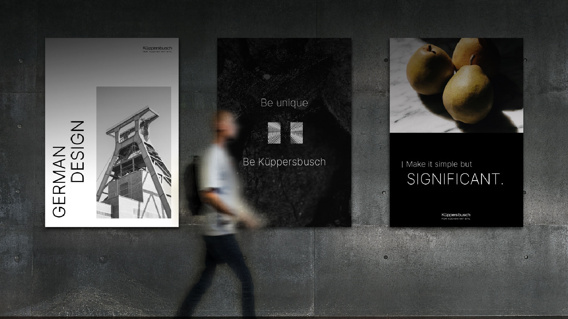
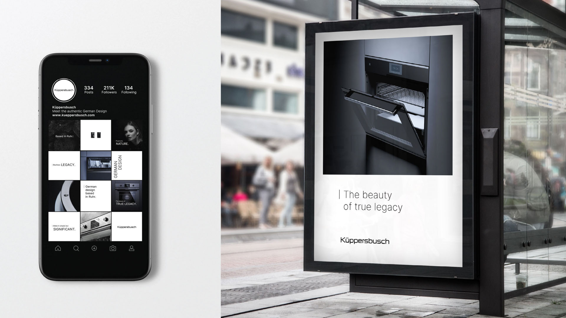
“Make it simple but significant.” This concept guided the global rebranding of Küppersbusch, the German company founded in 1875. It was a major project and a significant responsibility: revitalizing one of the most awarded brands in German design. A company that experienced the height of the Bauhaus movement, helped redefine global design, and established standards of aesthetics and functionality that continue to influence the industry today.
Our role was to reinterpret the original principles of German design, precision, efficiency, and quality, through a contemporary identity that brings together design, quality, and personality. We combined the rigor and rationality of German design with an approach that reflects personalization and an appreciation for the uniqueness of every customer.
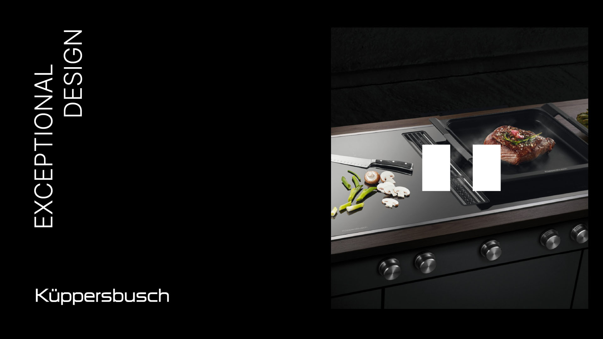
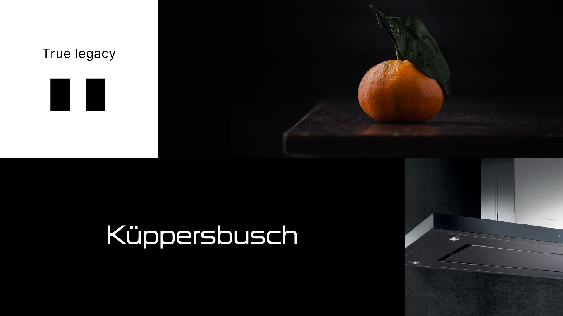
Nothing is more German than the umlaut. Inspired by this symbol, we developed a proprietary visual system that became the foundation of the new identity. From it, we created a functional and versatile grid applied across every touchpoint, from advertising and catalogs to digital platforms. This graphic element expresses the rationality of German design, while the photographic style introduces emotion and sensory depth. The imagery explores details, textures, and real-life moments, celebrating the union of form and function.
The result is a brand that is simple, efficient, and emotional, one that highlights both product design and the experience of those who use it. A visual identity that preserves the essence of Küppersbusch while projecting it into the future. A legendary brand with 150 years of history that continues to transform everyday life through the elegance and precision of true German design.
- Brand strategy
- Product positioning
- Branding
- Visual and verbal identity
- Brandbook
- Design digital