Lins Agroindustrial
Lins was born from movement. From the pulse of the land, the people who make things happen, and the energy that renews itself every day.
The challenge was not simply to create a new brand, but to reveal an authentic and inspiring truth that already existed: a modern, efficient, and people-centered agribusiness company.
Keenwork led the entire repositioning process, from strategy to branding. Over nearly a year, we worked closely with different areas of the company through research, analysis, workshops, and co-creation sessions to translate the business's evolution and its vision for the future.
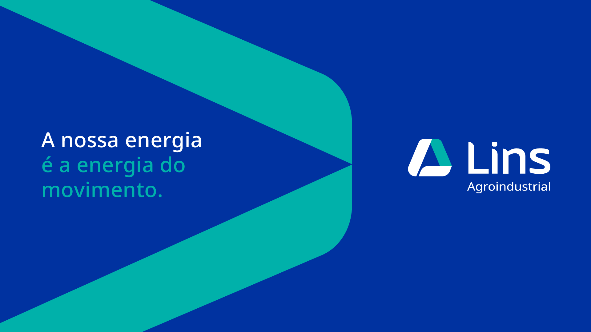
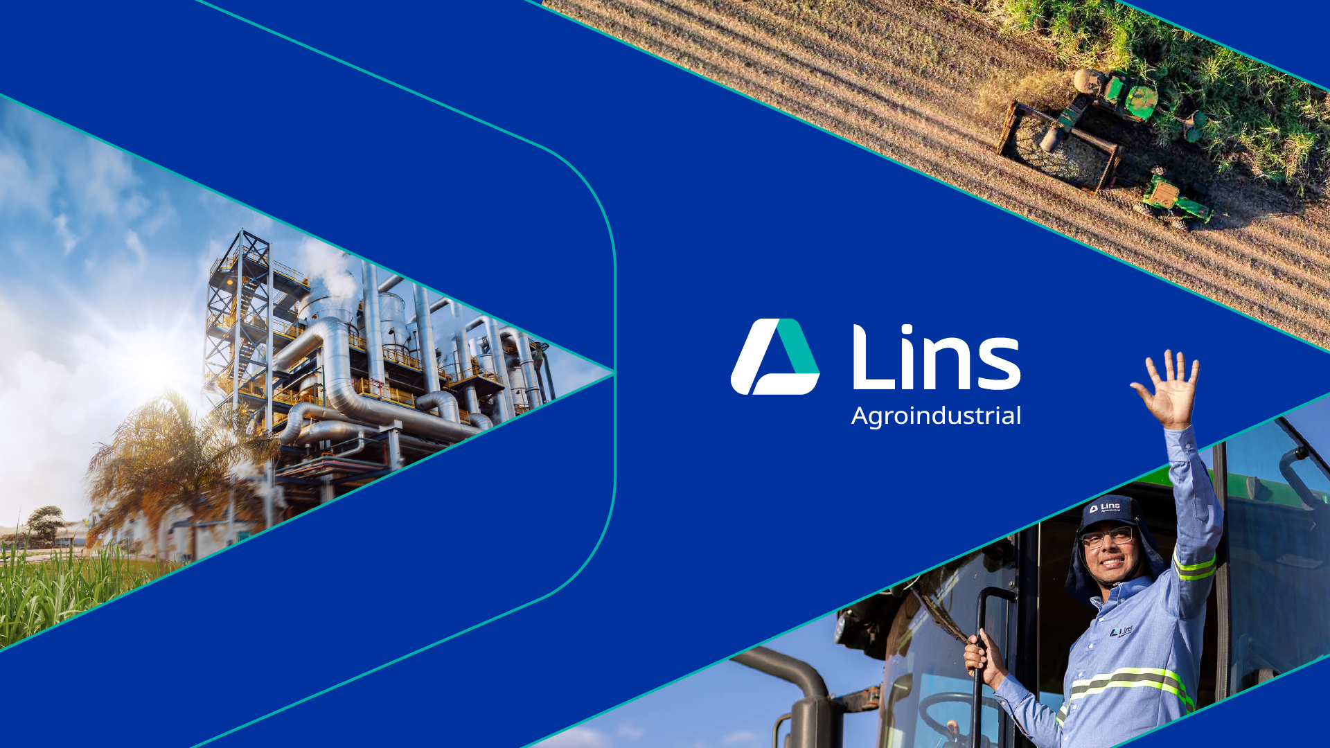
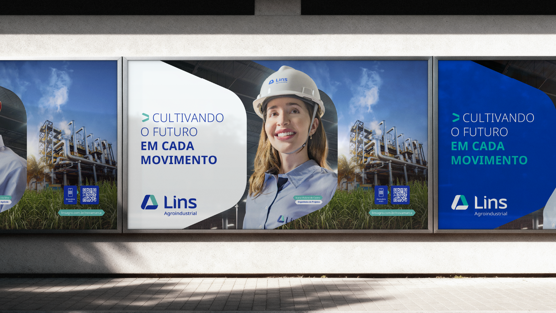
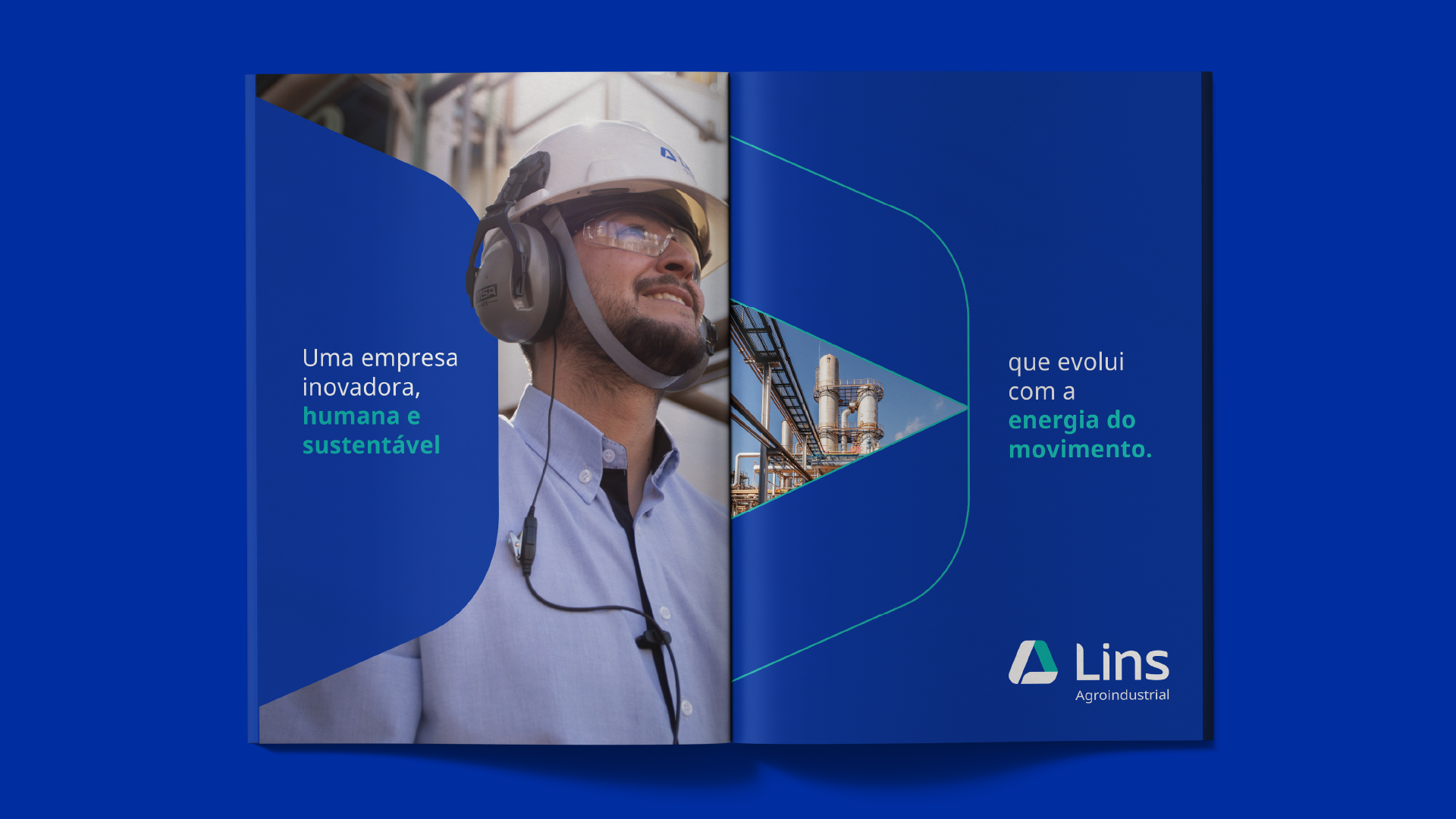
The new logo combines the initials L and A to form an arrow, symbolizing progress, continuity, and forward momentum. The blue and green color palette reinforces the company’s core pillars: efficiency, sustainability, and innovation.
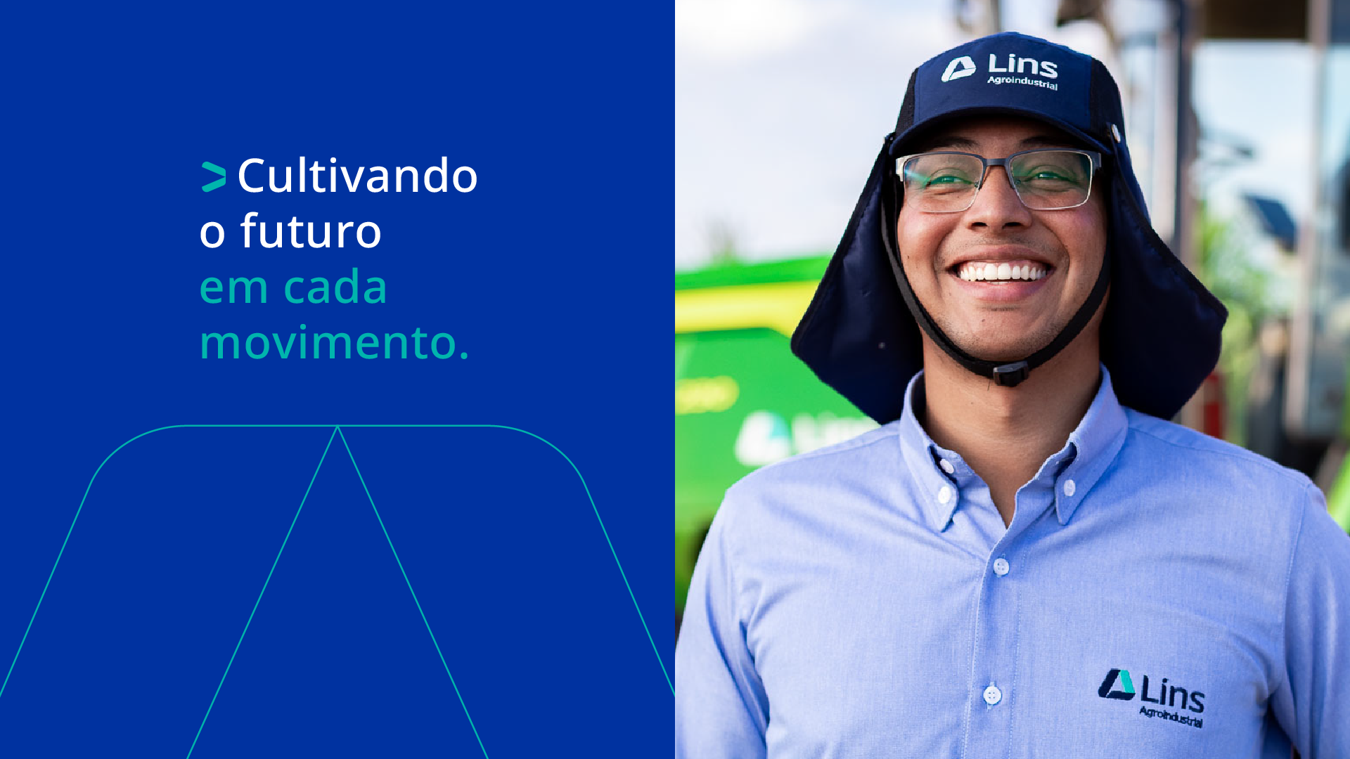
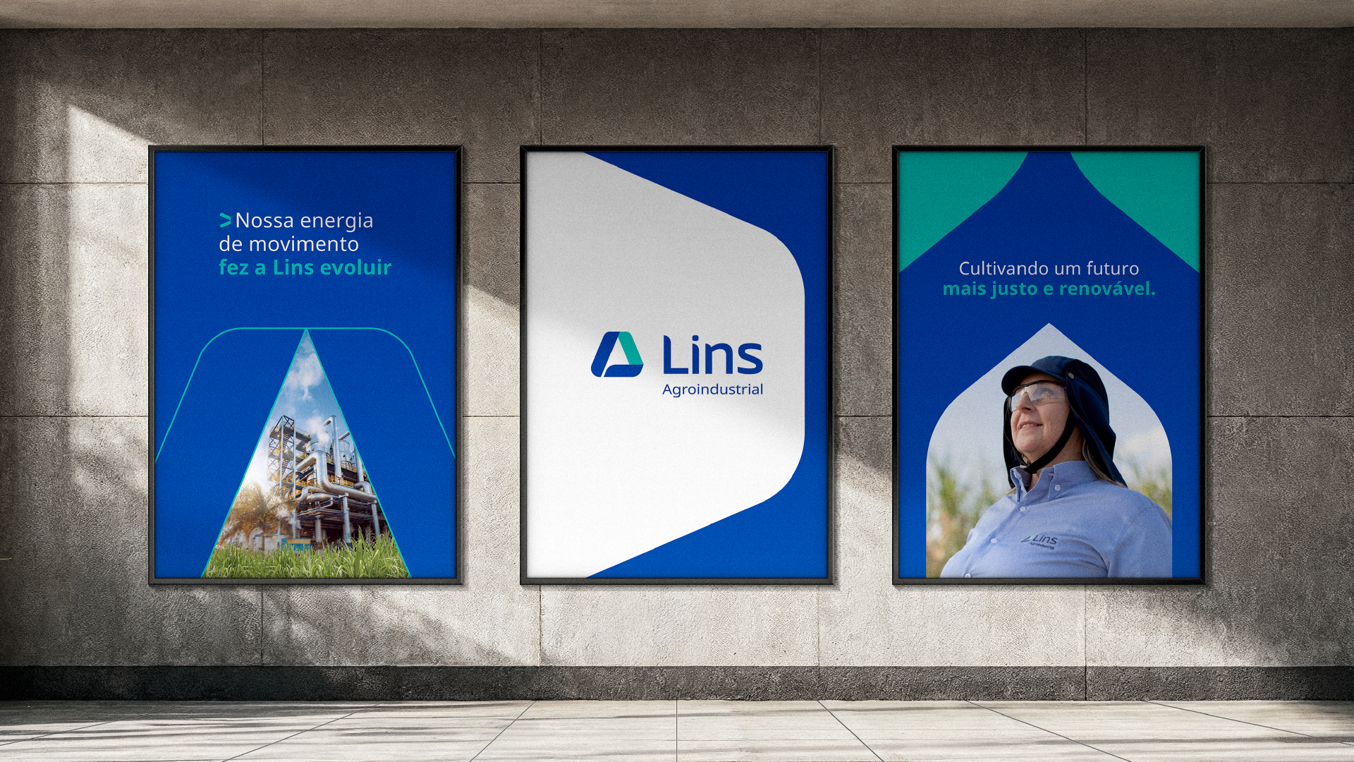
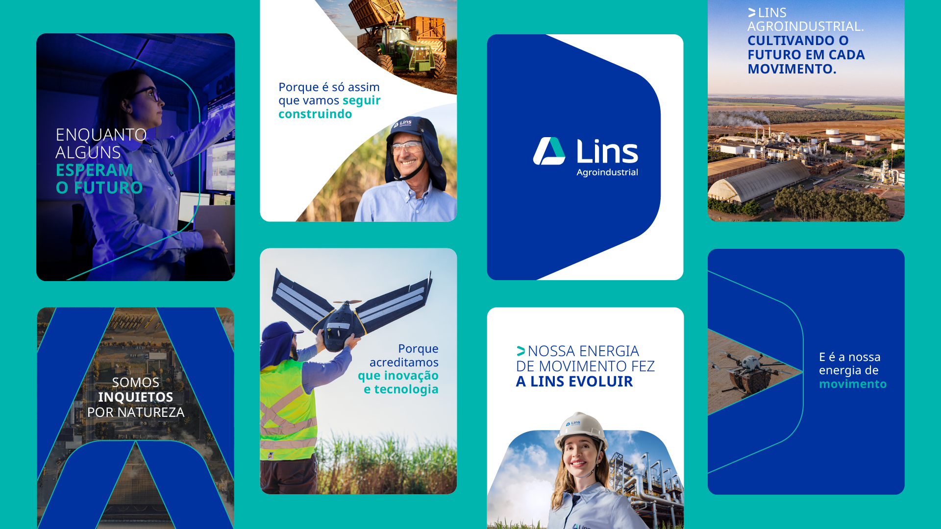
Beyond the rebrand itself, Keenwork also developed the go-to-market strategy, which included internal and external launch campaigns, a manifesto film, a brand film, online and offline campaign assets, and a custom photography shoot. The result was a proprietary image library featuring the company’s own employees as the protagonists.
After all, the land is where our story begins. Inspired by everything it teaches us, Lins Agroindustrial has evolved.
Energy in Motion.
- Brand strategy
- Brand positioning
- Brand narrative
- Logo
- Visual identity / Verbal identity
- Naming
- Landing page
- UI/UX
- Brandbook
- Design system
- Tagline
- Campaign concept / Key visual
- External launch campaign
- Internal launch campaign
- Landing page launch
- Manifest film
- Brand film
- Campaign film